Happy 2023! We hope your year has kicked off to a great start! It certainly has with Kurve v1.20 making its official arrival. This release will enhance your ability to report on your TRIRIGA data further with exciting new features like the Combo Chart functionality!
Click on a feature below to learn what is new:
Simply put, a Combo Chart allows you to visualize multiple related series with different chart types all in one graph.
Combo Charts are used to compare the relationship between two or more series. A series is a set of data in which different series types can be combined in a single graph.
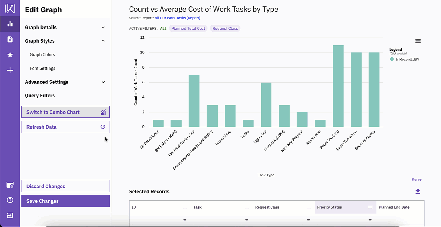
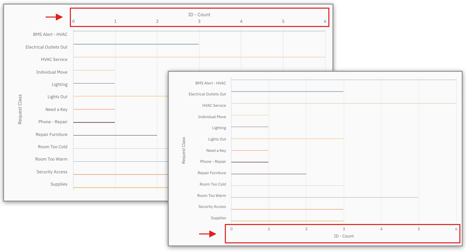
Let’s use an example! Pretend that you’re on the facilities team evaluating your work tasks. You want to visualize the task type by the count of tasks and the average cost of the tasks. A Combo Chart should be used to display the relationship between these data points!
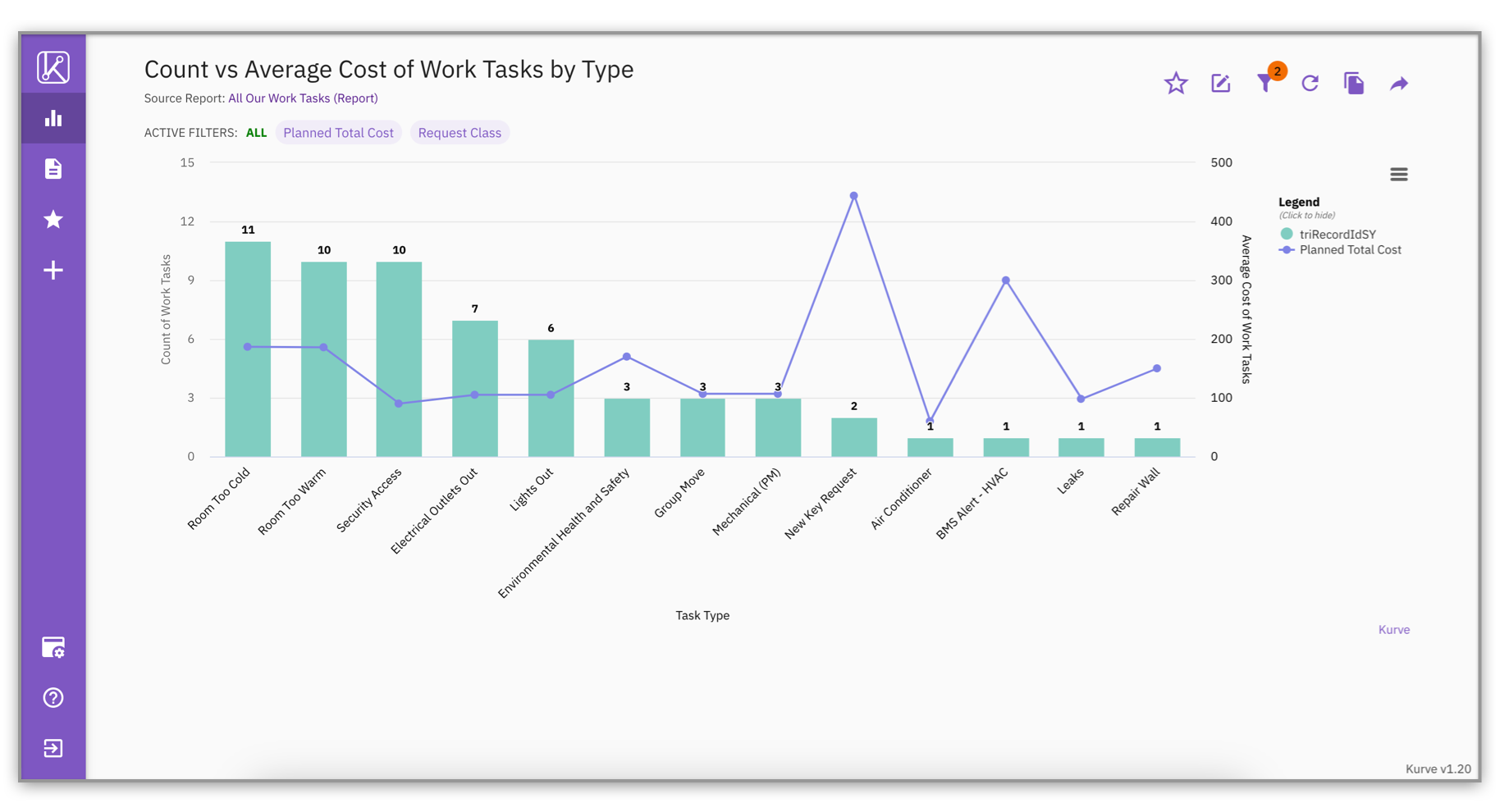
To be more specific, let’s look at the number of Room Too Cold work tasks below. You can see how many Room Too Cold tasks need to be fixed and the average cost to fix the total of those work tasks.
The graph below visualizes the count of Task Types (Column Graph) with the average cost of the Work Tasks (Line Graph) on two separate y-axes.
I know you may be scratching your head thinking these two sound the same, but they have different purposes.
Multiple series are used for a single chart graph type and a Combo Chart is used to combine multiple graph types together.
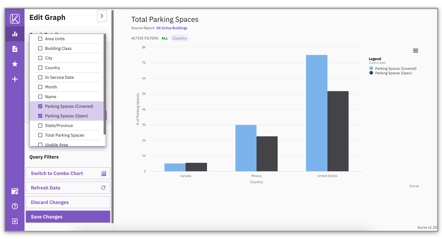
To go more in depth, when using a multiple series, you can select up to 10 measure columns for one graph type. For example, if you want to compare the number of “covered” parking spaces versus the number of “open” parking spaces. This graph would look great as a bar or column chart that compares the two series, like below:
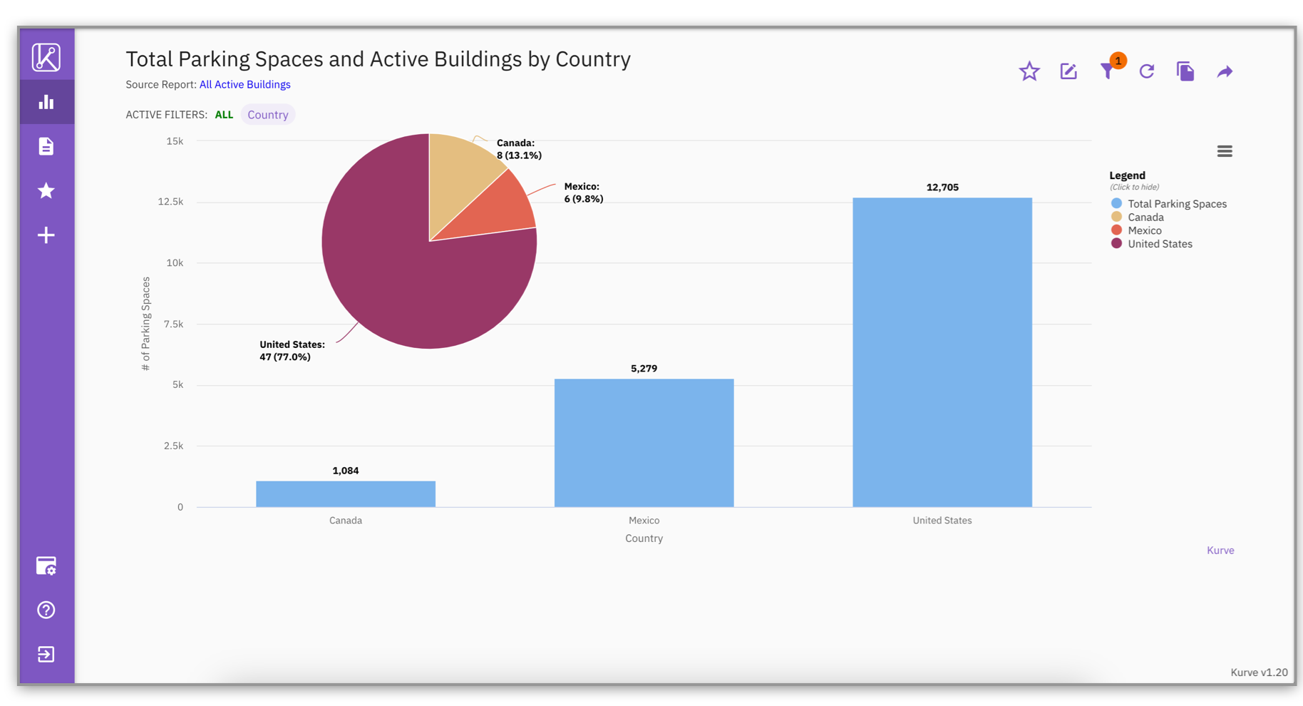
Switching to a Combo Chart allows you to graph multiple measure columns using different graph types and display it all together in one visualization. For example, you want to see the total number of parking spaces by country AND the distribution of your active buildings by country. This visualization would look great with a pie chart (active buildings) overlaying a bar chart (total parking spaces) as so:
Have you considered how you would use a combo chart with your TRIRIGA data? We’d love to hear about your use cases!
A Combo Chart can be created in two simple ways!
BEST PRACTICE: When creating a Combo Chart, we would recommend using two y-axes; one on the left and one on the right to compare measures that are drastically different in values. Displaying two y-axes on either side of the graph will encourage easier readability!
New year, new custom column function…and this is a good one! The ‘StartofWeek’ function allows you to output the start of the week of a given date field.
Custom Columns are a powerful tool that empower end users to create new calculated fields based on existing data within a Kurve report! These custom columns can be used to:
It allows users to easily create new calculated fields with existing data instead of needing admin access or exporting to Excel.
Ultimately, this saves you time as you don’t need to ask or wait for your TRIRIGA administrator to create these columns for you within the system.
You can now add a new custom column that displays the starting date of the week using the StartofWeek function. You can set the start of the week on any given day with a number from 0-6. The default, 0, is set to Sunday.
When creating a new custom column, open the expression builder to use this seamless function!
Showing is easier than telling! Let’s dig into the following example:
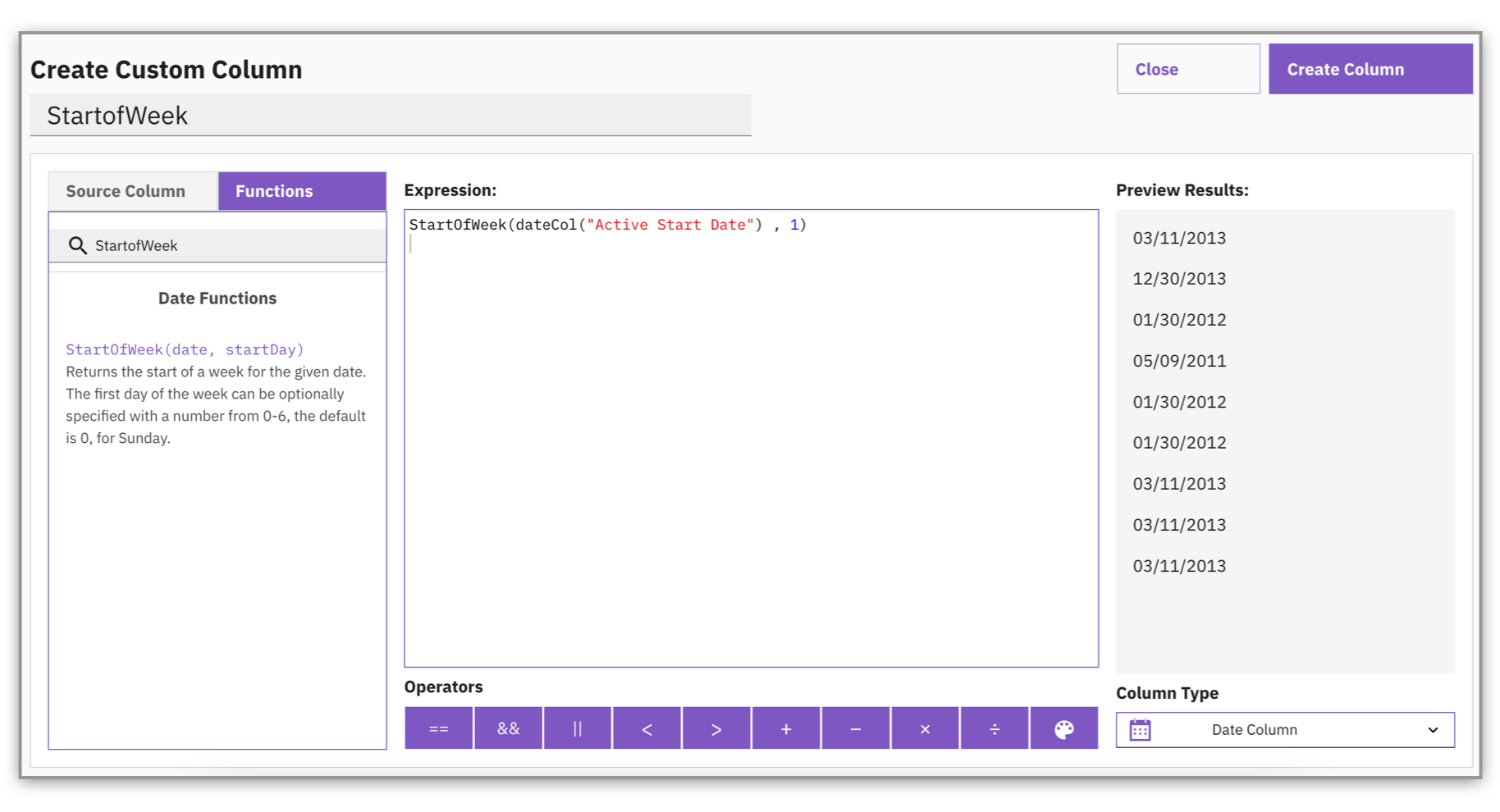
The custom column has been created with the desired column as "Active Start Date" and the start of the week as Monday. Monday is denoted using “1” in the formula above.
Please refer to Kurve’s User Guide for step-by-step instructions on how to add a custom column.
You benefit from using this new StartofWeek function in both Kurve reports and graphs because it helps make your visualizations more:
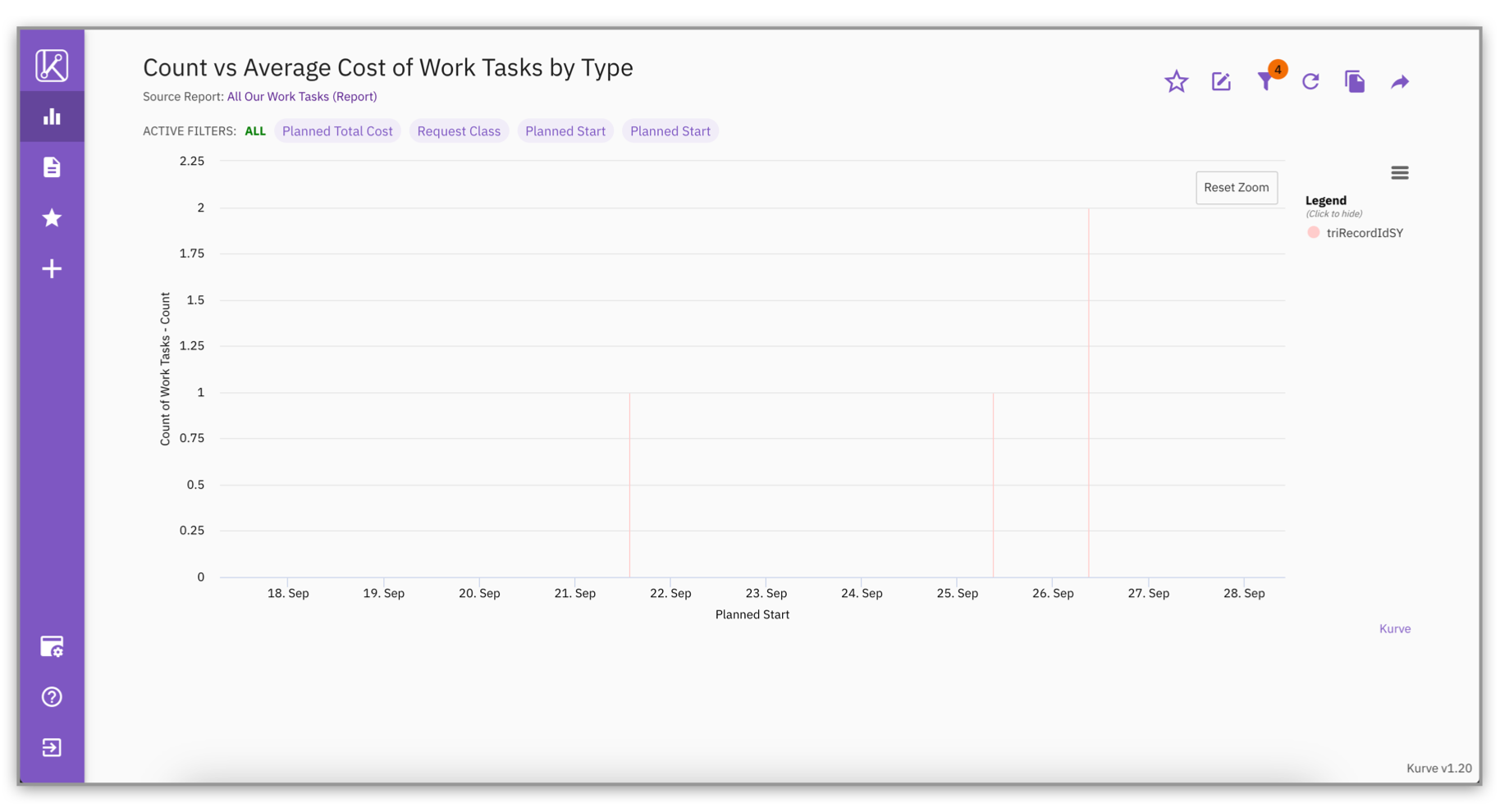
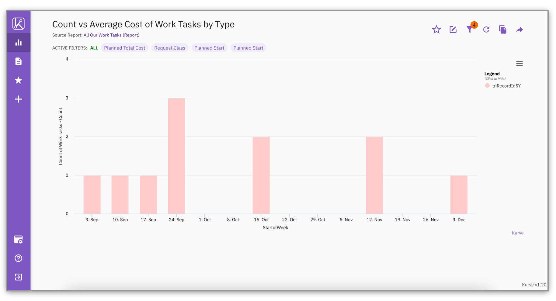
The StartofWeek function is useful for simplifying how you group dates in a report or graph. This ultimately helps the audience read and digest information quicker. You can see this in action when looking at the example below:
In the first graph, there are so many individual dates to look at on the x-axis that the graph is difficult to read and understand.
By using the StartofWeek function, the individual dates are grouped by the start of the week. This makes the graph easier to read by reducing the number of dates shown on the x-axis.
There you have it! Now you know how the new StartofWeek function helps you with visualizing your TRIRIGA data!
There are two graph setting updates in this release:
The Align Axis is a feature that will allow you to better customize your graph for enhanced readability. You can position your y-axis according to your graph type. This will give you the flexibility to align your axis to the Left/Bottom or Right/Top of your single charts or combo charts.
A Column, Stacked Column, Line, Scatter, and Area graph will align to the left or right of the graph.
For Stacked Bar and Bar graphs the y-axis will align to the bottom or top of the graph.
In previous versions of Kurve, if you’ve chosen to show the graph total, it has been displayed at the top center of the graph.
To better accommodate for displaying multiple graph totals with a combo chart, the graph total is now positioned at the bottom left of the graph.
To add the graph total, it’s enabled in the same place as before! Edit Graph, select Advanced Settings > select Label Settings > click “Show Graph Total.”
Well, that sums up our new features for this release! We hope you find the Combo Chart, StartofWeek function, and graph settings useful for visualizing and interpreting your TRIRIGA data.
While you patiently anticipate the next release of Kurve, don’t forget to subscribe to Kurve’s Email List for updates, tips, and more on our home page!
Wishing you all a safe and happy 2023!
.png)


.png)


